Mobilizon feels and looks great, but it seems like it is not quite optimal for a few reasons regarding design. The experience of posting publicaly and privately seems to be quite similar. Carefully hooking of different settings to make sure it is member content rather than public makes me kind of scared posting stuff, because what if I forget to hook one of the settings –
The point here is that I think Mobilizon could benefit from more simplicity and more clearity.
We could take inspiration from Mastodon who is using icons to determine the openness. They use four options, each with icons. the globe for public, moon for silent public, closed keylock for followers and the at-symbol for private.
but this is still not good enough, because public posts looks exactly like private posts.
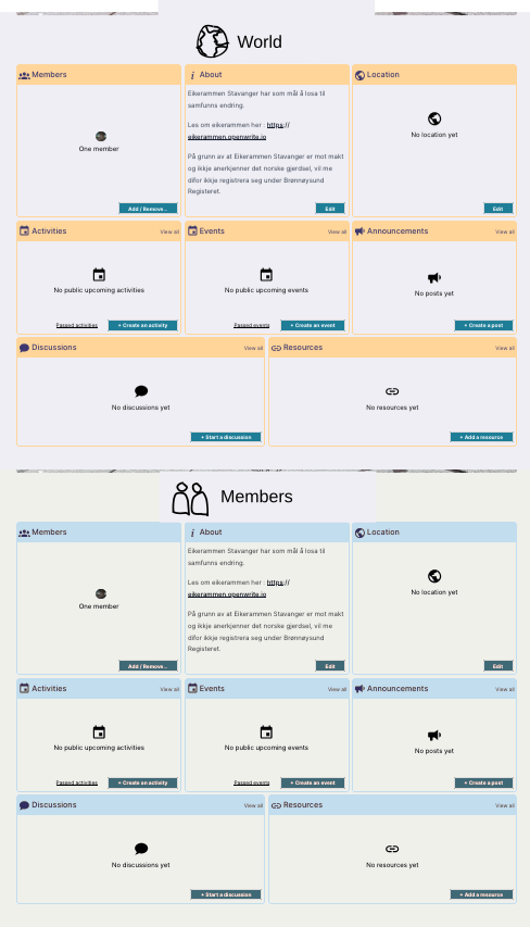
Mobilizon should make it very clear whether a post is external or internal. We can do this by dividing the dashboard of a group into two. The external section and the internal section. Let’s call them the worlds board, and the members board. By branding these boards well, we can make it almost impossible to mistakenly post publicaly. Below you can see a rough sketch of what I’m envisioning.